Is it “best practice” design, or just stealing?
Is it “best practice” design, or just stealing?
Is it “best practice” design, or just stealing?
Is it “best practice” design, or just stealing?
Is it “best practice” design, or just stealing?
April 29, 2015
April 29, 2015
You’ve probably heard this age old quote:
You’ve probably heard this age old quote:
You’ve probably heard this age old quote:
“Good artists copy; great artists steal.”—Pablo Picasso
“Good artists copy; great artists steal.”—Pablo Picasso
“Good artists copy; great artists steal.”—Pablo Picasso
We think Picasso might have said this because he thought that people are exposed to lots of information in their everyday lives. He proposed that no idea is unique, but we just borrow ideas from those around us. Picasso isn’t the only one either, the late Steve Jobs firmly believed that the best products of our time aren’t completely new innovations, but just great ideas copied and packaged into a new, accessible format.

Take for example Xerox, who developed the first graphical user interface. Bill Gatesand Steve Jobs ended up fighting over this idea. Bill claimed that “It’s like we both have this rich neighbor called Xerox, and you (Steve) went to steal his TV only to find that I had already stolen it”. Today, we know these ideas simply as Windows and Mac OS.
The balance of outright stealing ideas and developing on them is up for debate though, especially in the age of digital design. In the world of web design; “Hamburger” menu icons, graphical symbols and one page websites are just some examples of how popular digital products are being designed today. Let’s take a look at a Facebook’s user homepage:
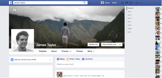
Look familiar?
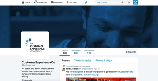
It should, Twitter’s is nearly identical.

As is LinkedIn’s.
As a user experience designer, I have to balance creativity with properly understanding the user’s needs. Part of this process is to understand when best practice design should be used, and where I have a little more room for creativity. Best practice design includes how to:
1. Understand page hierarchy
It’s simple: Keep the important titles in larger sizes, trickle down to smaller sizes for things like body text. Use white space to allow information to breathe, and remember that in the vast majority of world; we read top to bottom, left to right.
2. Design with mobile in mind
Mobile users accounted for 40% of page views in 2014. If your site isn’t usable on a mobile device, you’re missing out on a lot of viewers. Make sure that the page scales to a readable format, words are correctly sized, and buttons are large enough to click on.
3. “Chunk” Information
People remember more information if it’s broken down into smaller pieces. Remember not to overload users with paragraphs of instructions and text.
4. Stay consistent
Using different sizes, fonts, colours and layouts just confuses your users. Use templates and make sure things remain consistent across the whole experience, or your users will forget they’re still using the same product.
5. And most importantly: Remain as simple as possible, but not any simpler
Remove irrelevant things and keep the focus on the content, but make sure you’re not alienating your users by hiding everything to keep the interface clean. It will confuse and annoy people.
Follow these principles, and you’re ensuring that you’re stealing from the best ANDstaying creative. When you’re next designing something, just remember that it’s OK to keep using the classic hamburger icon for menus.
Just don’t steal any TVs.
James Taylor - Design, product & data leader based in Sydney.